This weekend, Heartland, an excellent tile-laying game by Jeff Allers (who writes for this site), was on the BGG hotness list. The game, published 11 years ago, is a personal favorite, but I could not figure out why it was trending. After some discussion behind the scenes, we learned that a popular Reddit thread had pegged it as a good game with embarrassingly bad production value. Though I personally like the old theme, I’ll admit that I sold my copy of Heartland as soon as it was reimplemented with better artwork by Gunkimono.
This came at a time when I’ve been thinking a lot about artwork in games. I tend to prioritize mechanics, but artwork definitely means something to me. I have the old Alhambra Big Box, for instance, but I’ve been considering shelling out for the new Alhambra Revised Edition, just because I like the look better. And I recently sold off my copy of Princes of Florence because, at this point, that game is an eyesore that nobody will play with me.
But really, artwork and production value means something to the vast majority of us. Would Azul have won the SdJ if it had cardboard tiles instead of the plastic ones? I doubt it. Would Wingspan be as popular without the vibrant colors and exceptional production value? I’m skeptical. In the year 2020, not only do aesthetics matter, but they seem to matter a whole lot, especially when it comes to game awards.
Facelifts are an increasingly lucrative and popular trend in gaming. Brass: Lancashire did well on Kickstarter with a stunning new version. Castles of Burgundy got its 20th Anniversary Edition with more vibrant colors. Kemet made hundreds of thousands on Kickstarter with a new edition (Kemet: Blood and Sand). The list could go on and on.
So I thought I’d make a list: here are 7 games that I love — games that, beyond my personal enjoyment, I consider objectively great games — that can use a production upgrade.
I do apologize in advance to our international readers: this is a bit US centric, since I am aware that a few of the games on the list have more attractive international versions.
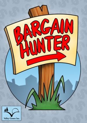
Bargain Hunter is a great trick taking game from Uwe Rosenberg. It received a US release a decade ago from Valley Games, but just a few years later, you could (ironically) find it in bargain bins. I think the artwork is why more people didn’t pick this up… it was dated from the day it was released, and the card quality was underwhelming (and by underwhelming, I mean aggressively bad).
Like many on this list, Bargain Hunter was on our list of 50 Modern Classics, coming in at #46. If it had an artist’s touch, however, I think it could reach a new generation of gamers.
Bohnanza
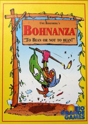
The Reddit thread this weekend raised Bohnanza, citing both the theme and the artwork. I’ll agree that the theme is weird, but I personally find it kind of charming. That said, regarding the artwork… ooooof. It screams mid-90s, which I guess makes sense, because the game was actually printed back then. Also, the box hurts my eyes.
Bohnanza was #15 on our list of Modern Classics.
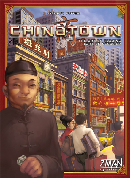
Chinatown
Chinatown goes in and out of print, and everytime it is getting ready to come back, I hope that it’ll be a fancy new edition. But nope… they largely keep the same art. This game has a chance to be beautiful, and to better represent the communities from which the game gets its theme, but that mission seems abandoned by the publishers. Plus, the cardboard money that comes with the game is basically useless… it is difficult to tell the denominations apart, plus I know very few gamers who appreciate cardboard/paper money.
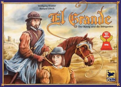
El Grande
El Grande won the SdJ. It is historically significant for inviting the hobby to veer towards more heavy games. It was #16 on the OG’s list of 50 modern classics, and it is in my personal top 5. I was ecstatic when it got reprinted in big box form a few years ago.
And yet, even I’ll admit that the game is a bit drab, a fact that becomes more noticeable year after year. I once liked the art, and the game was likely well produced in its day, but it has sadly fallen behind the curve. I like how the map looks like an old time map, but I think it could use some extra work, and the other components are a bit hideous.
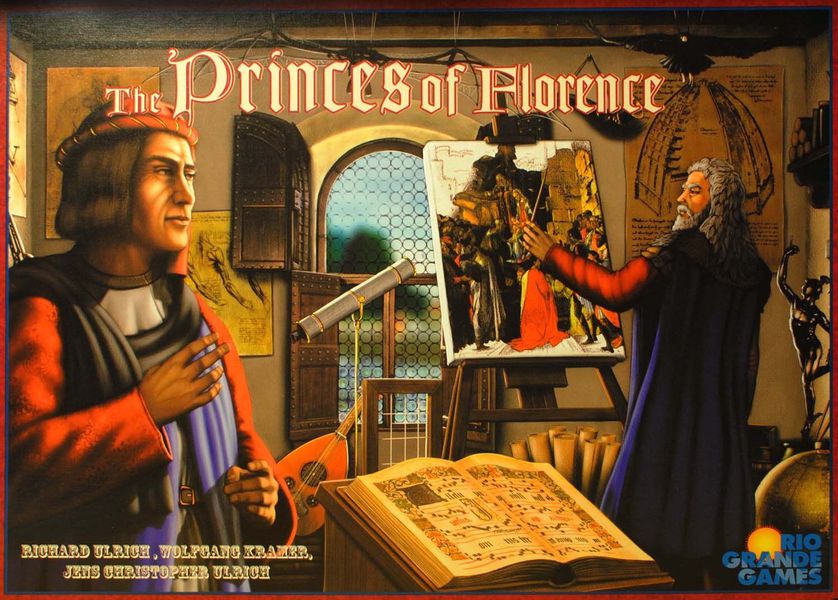
The Princes of Florence
There is an attractive Italian version of the game, but the most recent English printing I have is drab and unappealing. It is a great game — it is #4 on our list of 50 modern classics — but sometimes I get a little bored just looking at the box. As I mentioned above, I recently sold my copy, but I hope to have the chance to buy it again in the future, assuming there’s production value to match the excellent mechanics.
I get what the art here was going for — it was attempting to capture the period in which the game was set — but I don’t think it did it as well as it could have, as evidenced by the superior looking Italian edition.
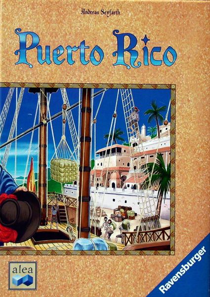
Puerto Rico
If Puerto Rico were released today, it would have upgraded bits for each type of good (rather than little cylinders), feature better artwork, have add-on metal coins, probably contain cool little 3D ships, and be more socially conscious. Sure, it might cost a fortune with enhanced bits, but I’d pay it, and I think thousands of us would. Sadly, this all seems unlikely to happen, since the game was recently reprinted with the European artwork, which is just a minor improvement. Maybe we can hope for something special at the 20-year-anniversary in 2022?
I have the 10-year Anniversary Edition, which is an upgrade, but it is only nice by the standards of a decade ago. For a game that was long BGG’s #1 game, and a game that was #5 on our list of 50 Modern Classics, I’m surprised more attention hasn’t been paid to its production value. I guarantee that if a publisher put a deluxified, upgraded version on Kickstarter with what I mention above, it’d raise several hundred thousand dollars.
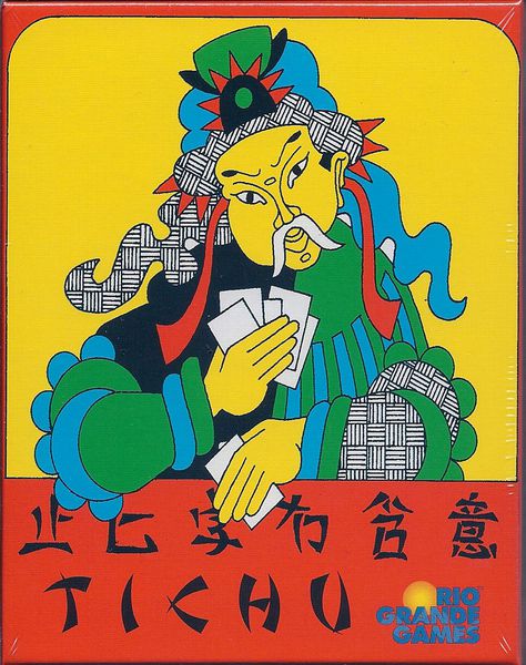
Tichu
I love Tichu. Lots of people love Tichu. It is probably the hobby’s favorite climbing game, as I recounted a few years ago. But the game does need a facelift to attract a new generation of players. The artwork that worked well in 1991 could be redone.
Over the years, there have been some truly beautiful editions of the game (such as the Italian edition, or the 2015 special German edition, both of which I show at the link above), but here in the US, the game hasn’t changed much in decades.
Also, this desperately needs a good player aid. There are some good ones on the Geek for printing, but the player aids I’ve seen come with the game are not great. I recently played this with a new player, and I could tell that they needed something to remind them of valid combinations and the special cards.
Here’s what we need from a new edition of Tichu: new artwork, still in a double deck box, with an illustrated rulebook, player aids, and better card quality! Next year is the 30th anniversary… here’s to hoping for something new.
——
Larry: Chris, I have to say that you and I have very different tastes in gaming art. Probably that’s because I discovered German games about 15 years before you did, so saying something has a mid-90’s look is likely to be a feature with me, and not a bug. But to me, good art is timeless, so I’m not even sure that’s it. It’s probably just differing tastes. Regardless of why, I strongly disagree with three of your choices. Here they are:
- Bargain Hunter – I love the card art in this game! I mean, who doesn’t love a happy toaster? Actually, the art I really adore is from the original game, Schnäppchen Jagd; they tried to duplicate it in the English language version (Bargain Hunter) and they came close, but it’s just a little bit off. Still, the art in both versions is delightful and I hope they never change it.
- Bohnanza – Okay, now you’re just being crazy! The card art in Bohnanza is positively iconic! Tens of thousands of people have fallen in love with it! I guarantee you that Björn Pertoft’s brilliant images have been a major contributor to this being the massive hit that it has been for almost a quarter of a century. I will grant you that the theme is bizarre, but that’s part of the game’s charm. But change the imagery? You’d have a gamer’s revolt on your hands!
- El Grande – I usually like cubes in games, but if you wanted to change them in El Grande to something a bit more meeply, I guess I wouldn’t object too much. And I certainly wouldn’t mind it if they came up with a King’s token that was considerably less, uh, phallic. But under no circumstances will I abide with any attempts to alter the game board. Doris Matthäus’ astonishing artwork is nothing short of gorgeous. It remains, 25 years later, probably my favorite piece of art in any game. And I don’t even like El Grande!
As for the other four games, the art in them has never bothered me in the least. So I find these to be strange examples of games that should get a facelift. But the three games I cited absolutely need to keep their appearance. Hands off, buster!
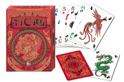
Chris Wray (Responding to Larry): Great art is timeless. But many of these games weren’t masterpieces to begin with, and they look dated now. To provide a concrete example, just imagine how cool it would be if you could buy this version of Tichu here in the United States:
Fraser
Bargain Hunter: Unfortunately I have never seen it, so no comment.
Bohnanza: I am 100% with Larry on this, any change would be for the worse.
Chinatown: We have the Alea edition and whilst it is not fantastic art, it is functional and my concern with an “upgrade” is that it would be another one of those triumphs of graphic design over usability and would actually be a retrograde step in terms of actually playing the game.
El Grande: <Lana Kane voice> Nope. </Lana Kane voice> and then add something about “cold dead hands”.
Princes of Florence: Again, we have the Alea edition. Granted that the font could be a little clearer for those of who are getting older, but apart from that there is nothing the matter with it.
Puerto Rico: Yes, real doubloons and actual goods made of the goods themselves would be amazing! Amazing yes, necessary no. Once again, we have the (one true original #7) Alea/RGG edition and it is just fine seventeen years down the track.
Tichu: Better quality cards I will pay. On a visit to Altenburger we were told that plastic cards (which last and last and last) cost eight times more than normal decent playing cards, which means plastic cards in hobby games are a long way off – except for Bridge Clubs.
Sometimes upgrades work, Chicago Express is definitely much nicer than Wabash Cannonball. However, sometime they don’t, we stripped the coins out of the deluxe edition of Caylus and put them with our original version as the playing copy because the deluxe edition board would look nice hanging on the wall, but not to actually play the game. Oh in the interests of full disclosure I will admit to buying Formula D after seeing those three dimensional car control panel things, just to use them with Formula De.
Matt Carlson:
I like fancy bits, and admit to buying a few “upgrades” to original printings (Through the Ages comes to mind.) In my mind, I appreciate a nice board but my main requirement is clarity of play (does the art make it harder to play?) However, as a gamer amongst “beginner” gamers, I have to admit a flashier game is more likely to make it to the table.
- Puerto Rico – I’m fine with the art as it is – I think it’s clear and thematic, probably wouldn’t upgrade, but could concede some might like better “bits” (money & tokens.)
- Bohnanza – I find the art hilarious, particularly as I feel like it shows off a somewhat european mindset of the various countries. The artwork is clear and playable, I don’t see a reason to change it.
- El Grande – The art in this game seems to hit the nail on the head for the time period. The board looks like an old-timey map, and it does not hinder play. You could play around with the cubes or money maybe, and I think people would buy it. However, it isn’t enough of a big deal for me to wish for better ones. Please do change that King’s token. I confess I have to make a judgement call on whether to bring it out or not when playing with teens…
I do like fine bits, but am typically too cheap to want to upgrade a game with perfectly playable components. To add to the list of games that benefitted from good components, I think both Splendor and Sagrada would not be nearly as popular without the colorful, tactile bits.
Jeffrey Allers: I have to side with Larry on these games, Chris. I like Bohnanza “just the way it is (cue Billy Joel). I’d much rather see Small World with better art. Those garish colors on the game board were a big disappointment (see also Das Amulett and Clans). I still have it’s parent game, Vinci, which also didn’t have the nicest game board, but it’s easier on the eyes than the remake. However, nothing compares to the awfulness of Magna Grecia. Yuck! Maybe we just need to get Chris to play more pre-2005 Eurogames for reference. Oh–and bring back Doris Matthäus’ Carcassonne. At least, though, it wasn’t done in those dark tones that are puzzlingly popular these days.
Mark Jackson: Chris missed the biggest offender in the “Needs Better Production” sweepstakes – Medici. Each version has a problem, often fixed by the next version whilst creating yet another problem. It’s a testimony to what an amazing game it is that it has survived the horrors done to the art design. (Evidently, according to an email conversation with Larry, the newest version is better – I haven’t seen it yet.)
Otherwise, I’m with Larry… Bargain Hunter/Schnäppchen Jagd could use a better cover but the art/card design is fine. Bohnanza is a classic – and, admittedly, I played with my German copy for so long that I have trouble with the English names on the cards of other people’s sets. The original editions of the other games mentioned are just fine.
In my personal list of games that could use a facelift:
– Joe Huber’s Scream Machine (which ended up with card design that actively makes a great game harder to play… the prototype was substantially better and Joe created it with an ancient graphics program)
– Tom Lehmann’s Phoenicia (another game that the graphic design – and some bad development by the publisher – makes a great game incredibly difficult to enjoy)
– Dirk Henn’s Stimmt So! (whoever thought putting the scoring track around the outside edge of a board that you drafted cards off of EVERY TURN was not paying attention… and, yes, I know that Alhambra is in many people’s opinion the better version of Stimmt So!, but they’re wrong)
Michael Weston: You’re outvoted on Bargain Hunter, Chris, and Larry’s right that the German original is the better version. While I was never on the Bohnanza fan wagon, you can’t really change the theme – it’s in the name – and the art is great as-is. That is a gorgeous version of Princes, but like Fraser I have the original Alea edition of PoF and very happy with it. Our copy of (Alea) Puerto Rico has been pimped up with gifts of the MeepleSource upgrades, which I have to admit improves it. I think you’re on the money with the an “ultimate PR” KS being successful, I do like your ideas for what needs to be in a new Tichu edition. The 2015 edition you picture above is gorgeous. And Mark, you are spot-on that $timmt So is still the best version of that game and the score track on the board was a stupid decision. Finally, a perfect example of when an upgrade made a game objectively better was Stronghold Games’ CONFUSION back in 2011 – a huge improvement over the German original.
Erik Arneson: While taste in art is subjective (as so clearly evidenced by this article and our comments), there’s no question that presentation matters a lot. Just like book covers, game box covers are crucial to attracting potential buyers. And in the same way you’d (almost certainly) be turned off if a book used a terrible font (think Comic Sans or Papyrus… shudder) throughout, a game with artwork you find off-putting would be a challenge to play. Bad graphic design also comes into play, as with Mark’s example of Scream Machine (a terrific game). That said, the greatest art and design in the world will never get me to appreciate Tichu.
Brandon Kempf: Art is subjective, for sure, but we all know ugly games when we see them and most of what Chris listed is most definitely dated, if not outright ugly. Now, I don’t want every game from the 80s or 90s to come back and get a new look like Glen More did, which I expect would have made Chris’ list as well if it hadn’t been redone, but I do think that upgrading print runs is a necessary thing in this day and age. It’s tough to compete. We all know these games are wonderful for the most part, but new gamers are playing games with more physical appeal and if we want these games to survive, they need to adapt. The copy of Tichu that Chris posted in the comments, is the copy of Tichu that I keep. Last I knew it was still available, via importing but probably not right now due to Covid, et al. I like the clip art version of Bargain Hunter, it feels like a garage sale, but yeah, nicer card stock and some more modern design to them wouldn’t hurt, but I still don’t know that I’d be able to get it to the table as much as I wish I could. Bohnanza could use some better art as well, I mean every time I see the Stink Bean I wish I hadn’t played even though the game is always wonderful. Chinatown & Puerto Rico could use some thematic updates as well as a facelift if they want to remain relevant with today’s more socially aware gamers. Wonderful game designs that definitely show their age rather poorly in theme and artistic vision.
Manhattan was another wonderful — Seyfarth’s best design — game that needed a facelift and got one. It has increased the reach of the game to newer gamers. Now, you can make an argument that it doesn’t look like you are building Manhattan any more, more like South Beach, but the brighter, more modern vibrant design is far more appealing.
Seems I am kind of the opposite of most of the other folks here, I like the colors to be more vibrant, more lively. Usually makes it easier for me to differentiate things. El Grande is about the only game that I can think of that I prefer in forty shades of brown with plain ol’ cubes and a weirdly phallic king token.
Larry: You’re absolutely correct about Phoenicia, Mark. Great game, but the publisher did a hatchet job on the rules and physical design. Tom’s original prototype was more attractive and significantly more functional.
James Nathan: For my tastes, I’ll take all of those as they stand. For that matter, I take most games as they stand, with regards to their art. For most new euro games I play, I think, why can’t this have the clean art and graphic design of things like…Puerto Rico. Why can’t this card game have the basic user interface of something like…the coins on the back of the cards in Bohnanza. I miss the days of Chris’ examples above when I play a new game from you-know-who or old-what’s-their-face. I might be less of a curmudgeon about titles coming out of North America or Europe these days if they dialed back the art and graphic design to this era.
Let me sum my tastes up: if your Kickstarter offered an option for a no-art and basic line drawing graphic design edition (e.g. Winsome), I would pay you more for that version! Your stretch goal should be to remove the art.
Chris Wray (In Conclusion): Comment below! What do you think of these games? Lobby for upgrades from the publishers, or feel free to disagree strenuously! :)
Tichu artwork should be left alone. The game has its origins in China and the artwork really evokes that particular period and style. I have the Fata Morgana pocket edition and I think the artwork is even more quirky. If you switch to some contemporary artwork, I think you lose a large chunk of the history. It’s akin to saying that Mahjong tiles ought to be updated with new symbols. I bet you can’t find a single person that would agree with you.
Bohnanza is a classic and the artwork should remain as such. The illustration is funny and thematically appropriate. I don’t think new artwork will improve the aesthetics at all. How about some photo-realistic stink beans, eh?
I am not convinced new artwork is necessary for all “ugly” games. Take for example Saint Petersburg. I am neutral toward the original artwork. Some may call the original art awful but I think it has its charm. The newly reprinted art has all these photo-realistic renditions. The game play has improved, but the artwork though?
I would love to see Mah Jongg get updated with new symbols.
I guess you just proved me wrong :)
I am biased in favor of art changes. Chris sure got the heat for some of his suggestions but I agree with all of them!
Good article and discussions!
No kidding on the heat! You’d think I had suggested a redo of the Mona Lisa! :)
I’m also with Chris on all of these. I started into the hobby late, when Agricola was the new hotness, and so the artwork on some of these 90s-era games doesn’t feel “classic” to me. They just make my eyes burn, and as much as I’d like to play them, I know I’d never get them to the table with my younger gamer friends because of the artwork. (I can never get Puerto Rico off my shelf.) We’re shallow, I guess.
I think Chinatown would clean up with a Brass Lancashire-like makeover on Kickstarter.
Pingback: 7 Great Games That Could Use a Facelift – Herman Watts
Great article, and that Tichu version does look lovely.
I think art is a tough one to please all as so many old gamers (myself included) like unfashionable, crazy old art (I’m looking at you Hamburgum) – there’s an honest warmth to its simplicity and no small amount of sentimentality involved. You know, I really love the way boardgames used to live in their own art bubble, with tons of homebrew art styles, as opposed to the newer approach to ‘Pixar’ everything up but I suppose the hobby needs to appeal to younger folk who only ever watch films, youtube and TV when not gaming.
Also, when I see god awful redesigns and ‘luxury’ edtions (looking at you, Puerto Rico) that use gimmicky metal coins which could be bought from a $1 shop, and ridiculously oversized and overweight boxes, I always yearn for the original editions with slim cardboard chits and bendy bits. It’s all very personal as the comments clearly attest.
I fall completely in line with Larry. I actually have always enjoyed the artwork of ALL of the games you mention. Indeed, I adore the artwork in Bohnanza and Bargain Hunter (Schnappchen Jagd) and would be upset if it changed.
A post talking about improving the production value and the artwork in games and not a single mention of Modern Art? Wow!
I find the most popular editions to be absolutely terrible. I own a 90s edition that’s just very ugly. And I would love the gorgeous Korean edition to be cheaper. Actually, it should set the standard for this great classic game.
Having said that, I of course like to have the best aesthetic experience for my money. But deluxified editions have gone just crazy, partially thanks to KS. Rococo is a good game with fine looks. Now will be a good game with astonishing looks. For three times the same prize and double size the box. I’m not sure this move is in the right direction.
Happy gaming!
“If Puerto Rico were released today, it would have upgraded bits for each type of good (rather than little cylinders), feature better artwork, have add-on metal coins, probably contain cool little 3D ships, and be more socially conscious.”
The anniversary addition is totally fine, with sturdy tiles and metal coins. No need for anything further. About the slaves being called colonists, that is indeed an unforgiving euphemism. But I fail to see why the game should distort history and pretend that slaves were not exploited in the plantages of the New World.
I am a hardcore leftwinger but I cannot stand this contemporary attitude of ignoring real emancipatory struggles while taking the edge of everything. If things were harsh, pretending that they were not is an Orwellian distortion of history.
Gee, it is a game! You are not a fascist when you play Hitler in Triumph & Tragedy and you are not a genocidal maniac when your War Suns annhiliate the enemy in Twilight Imperium.
I’d list Indonesia as a game urgently needing a facelift. The map is impenetrable, and the cursive font is pretty but makes everything illegible. It’d be nice if they dealt with the siap faji/siap saji snafu too.
The CMON edition of Modern Art is excellent, though I believe out of print. The eyesore pop-art is precisely what’s needed for a game about uncertainty over the value of your art collection.
Nobody who plays and loves brass can think the new version is anything but an abomination. It seems to be expressly designed to look cool at the expense of readability and playability in a game where an understanding of the network and items in it is crucial. When you say you like the roxley version you earmark yourself as someone who has it as a shelf decoration
I’ve played brass over 50 times in person and 200 online (the order of the hammer which is actually by far the best graphical version of the game )
“Abomination” might be taking things a bit far (I’ll charitably say that tastes differ), but I completely agree with you about the artwork on the latest versions of Brass. I played Brass: Birmingham recently (on the *lighter* side of the board!) and it was very difficult to make things out. Very dark artwork is all the rage these days and I guess that’s fine if you’re in your 20’s, but older eyes like mine can’t deal with it. Ironically, I really liked the player mat they added and thought it made gameplay a lot easier. I love Brass, but if the only version available had that dark artwork, I’d avoid playing it, as it’s just too hard to see what you’re doing!
The trend seems to be “the more the merrier” not only for components, but also for art. Take a look at the new Maharaja, one of Kramer and Kiesling’s better designs. I love the game and the original art is simple and clean. If you look at the newly reprinted board, the art work is so dense and colorful that I can’t even tell where the pieces are located.
I am, however, glad the game got reprinted. I think the game deserves more air time.
A good example of a remake is Catacombs 3rd ed, where both the game design and art were greatly improved. Okay, so this wasn’t too hard over the original photoshop stock textures, but a great refresher nonetheless, and a new ed always means lots of old eds available on the cheap for newbs to pick up and try.
Pingback: Go All Out! 7 Games I’d Love to See Deluxified | The Opinionated Gamers